6. Native gauges
A gauge is each element of the dashboard. This chapter describes the 14 native gauges that show VCU data: 13 in the Meters category of the Add gauge window and 1, the Time selector, in Indicators. The Time selector is the only one that also writes. Images, PNG and SVG pointers, GIFs, shapes, buttons and cameras are in chapters 7 and 8; the data and the units, in 9.
#6.1 Properties common to all gauges
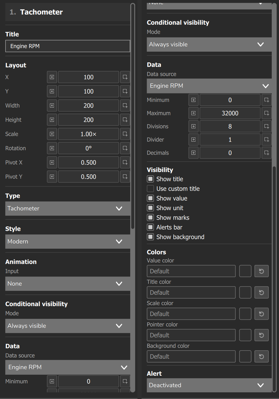
When you select a gauge, the properties panel shows these sections, in this order: Title, Layout, Type (only when the category has more than one type), Style (only when the type has more than one style, 6.2), Animation, Conditional visibility (7.5) and Data (6.3 to 6.5), where the fields specific to each type are. The tablet editor has no Conditional visibility: the tablet display applies the condition set on the PC (section 7.5).
#Title
The Title section has the Custom title field. In the Visibility section of the Data block, every type has Show title and almost all have Use custom title (the Shift, the G Force and the Time selector do not). With Use custom title on, the text of the field applies, and it is not translated. With it off, the name of the measurement applies, in the device language; if the measurement has no name, the text of the field applies. Not every style draws the title (6.6).
#Layout
| Field | What it does | Accepted range |
|---|---|---|
| X and Y | position, in dashboard px | -99999 to 99999 |
| Width and Height | size of the box; disabled in a Group | -99999 to 99999 |
| Scale | multiplies the box: width x scale is the drawn size | 0.01x to 1000x; default 1 |
| Rotation | rotates the gauge around the pivot | -360° to +360°; default 0 |
| Pivot X and Pivot Y | pivot, as a fraction of the box | 0 to 1; default 0.5, the center |
On the FT700, the FT700 Plus and the phone, with the layer locked, the Layout fields are disabled (section 4.4). On the PC and the tablet they stay editable. A new gauge starts with half of the type's default width and height and Scale 1; the size of each type is in 6.5.
#Type
The Type section swaps the gauge for another one of the same category, keeping position, data, Minimum, Maximum, decimal places and colors. A Circular gauge becomes a Tachometer, Speedometer or bar, but not a Time selector (another category). The size becomes the design aspect ratio of the new type, fitted into the old box, and Scale goes back to 1.
The swap keeps the position of the style in the list, not the name. Since the Tachometer has no Classic, a Circular gauge in Neon becomes a Tachometer in Cyberpunk, and in Cyberpunk becomes a Tachometer in Modern; a Tachometer in Neon becomes a Circular gauge in Classic. After changing the type, check the Style.
#Animation
The entrance animation runs once, when the gauge finishes loading as the dashboard is displayed.
| Field | What it does | Range and default |
|---|---|---|
| Input | Entrance animation list | 19 options; default None |
| Duration | animation time | 50 to 5000 ms, step 50; default 400 ms |
| Delay | wait before starting | 0 to 10000 ms, step 50; default 0 ms |
| Displacement | distance traveled on entrance | 10 to 500 px, step 5; default 80 px |
| Easing | speed curve: Linear, OutCubic, OutBack, OutElastic, OutBounce, InOutQuad | 6 options; default OutCubic |
Duration, Delay and Easing appear when the option is not None; Displacement, only in the animations that slide. The options, besides None: Fade in, Zoom In, Fade + Zoom, Pop, Flip horizontal, Flip vertical, Rotate in, Wipe left, Wipe up, Slide left, Slide right, Slide up, Slide down, Fade + Slide left, Fade + Slide right, Fade + Slide up, Fade + Slide down and Slide + Zoom. Among the slide names, Slide down enters coming from the bottom. In version 3.00.54, the Linear option of Easing falls back to the OutCubic curve.
#6.2 The styles: Modern, Classic, Neon and Cyberpunk
Each type has up to 4 styles. The style changes the whole drawing of the gauge (images, fonts and effects) and also which configuration fields it respects; the properties panel does not warn when the style ignores a field (the list is in 6.6). The Tachometer is the only one with 3 styles: it has no Classic. The default for a new gauge is Modern. The Style list shows the names in English in every language of the app; on any device you change the style there.
- Modern: vector drawing; respects almost all fields; it is the only one that draws the gradient (6.3, except the Ideal value gauge in Neon) and the peak marker of the Circular gauge.
- Classic: retro skin as an image; only pointer or bar, almost no numbers; Circular gauge, bars and Speedometer do not show the value number.
- Neon: images with a blue glow.
- Cyberpunk: scale in segmented sections.
#6.3 Colors and gradient
Each color field opens the Color / Gradient picker: Default (theme color), Solid (one color) or Gradient of 1 to 4 colors, of type Linear (Angle field from 0 to 359°; 0° goes from left to right), Radial or Axis (follows the value along the arc or the bar; in text and shapes it becomes horizontal). + Color adds a color and is disabled at 4. Alpha and HEX are the transparency and the color code.
The gradient is only drawn in the Modern style, and only in some fields of each gauge (table below). In Neon, only in the Ideal value gauge. In the other styles and fields only the first color of the gradient applies. The properties panel does not warn you.
Fields with a gradient in Modern (the other fields and gauges use only the 1st color):
| Gauge | Fields with gradient |
|---|---|
| Tachometer | Value color, Title color |
| Circular gauge, Horizontal bar | all, except Scale color |
| Vertical bar | Bar color |
| Ideal value, RPM bar, Digital gauge, Digital Horizontal | all |
In Modern, with the alert active, the alert red replaces the color and gradient you chose in the texts and edges of the Digital gauge, the Digital Horizontal, the Circular gauge, the bars and the RPM bar.
#6.4 Scale: divisions, divider and decimal places
| Field | What it does |
|---|---|
| Minimum and Maximum | start and end of the scale, in the unit configured in the map |
| Divisions | number of intervals between Minimum and Maximum; the scale has Divisions + 1 major marks and labels |
| Divider | divides only the scale numbers; the displayed value and the pointer position use the full value |
| Decimals | decimal places of the displayed value, from 0 to 4; in some styles it does not change the number (6.6) |
When you choose the Data source for the first time, the software writes Minimum, Maximum and Decimals with the default values of the measurement, converted to the map unit. When you change the data, it asks Reload data?: Yes rewrites the three fields and No keeps the current ones. It does not touch the Alert limits, Divisions or Divider (section 9.1). Adjust Maximum and Decimals by hand.
Recipe for a Tachometer from 0 to 8000 RPM: Minimum 0, Maximum 8000, Divisions 8 and Divider 1000. The scale shows 0 to 8, one division every 1000 RPM.
Not every gauge uses Divisions and Divider: each data sheet (6.5) says whether it does. On circular scales, if the numbers touch, reduce the Divisions. The panel accepts from -99999 to 99999 in these fields, except in the Electric gauge. Do not use 0 or a negative value in these fields.
#6.5 Gauge data sheets
Each data sheet gives the size when added, the fields that change the result (default and range), the operating rule, what changes by style and the main pitfall. The common fields (6.1) are not repeated. Defaults are those of a new gauge; sizes, in px of the dashboard drawing; colors in code (#RRGGBB) are those of Modern with the field set to Default. The category is Meters, except for the Time selector.
The types with a scale have, in Data, Data source (section 9.1), Minimum, Maximum, Decimals, Divisions and Divider (6.4). The alert (the Alert list and the limits Low alert and High alert, in the map unit, which only appear with a mode other than Deactivated) is in section 9.4, with the rule of each mode and what each gauge and style draws.
The Visibility section of each type groups the drawing's checkboxes; it is not the Conditional visibility (7.5). The base checkboxes are Show title, Use custom title, Show value, Show unit and Show background. The others are Show marks, Alerts bar (alert zone on the scale), Show arc (only on the Circular gauge), Show edge (only on the digital ones) and Show scale (only on the RPM bar). Each data sheet says only what differs from the base checkboxes.
Without a Data source, the number is "---" (0 on the Tachometer, the RPM bar and the Speedometer in Modern and Neon). With the source chosen and no value received, it is 0 for almost all measurements (for the lambda sensor, which measures the air-fuel mixture, 1); the Digital gauge stays at "---". The editor has no simulator: check each measurement with the VCU connected. What the gauge shows with no data or after a connection drop is in section 9.6; the update rate, in 9.5.
#Tachometer
Circular 270° tachometer, with a numbered scale, pointer and value arc. It is the only one without the Classic style.
| Item | Description |
|---|---|
| Size when added | 200 x 200 px |
| Minimum and Maximum | default 0 and 8000; with Engine RPM, the Maximum becomes 32000 |
| Divisions and Divider | default 8 and 1; the Divider divides only the labels: with 1000, the scale shows 7 instead of 7000 |
| Visibility | the base checkboxes, plus Show marks and Alerts bar; they start on, except Use custom title |
| Colors | default: value and title white, scale #B3B3B3, pointer red, background #121212 |
| Alert | starts Deactivated, limits at 0. Modern: the Above mode paints the fixed zone of the scale, from the High alert to the end. Neon: any mode counts as Above. Cyberpunk: no alert (9.4) |
The alert zone of Modern is a fixed marking, like the red band of a tachometer. For a warning that reacts to engine speed, use the RPM bar with the Above mode or the Shift. The pointer sweeps from -135° to +135°. In Modern, the scale has Divisions + 1 labels and 7 minor marks between each pair of major marks. The software fills an empty Custom title with the name of the measurement, but the text only appears on the display with Use custom title on.
Styles: Neon shows the current gear in a large font (T, P, R, N, 1 to 16, or U), with the previous and next ones beside it; Show value turns this digit on. Modern and Cyberpunk do not show the gear. Cyberpunk reads only title, value, unit, value color, title color and scale color, Divisions, Divider and Decimals.
#Speedometer
Circular speed gauge, with pointer, scale and central value. It only accepts speed measurements, such as Speed and GPS Speed.
| Item | Description |
|---|---|
| Size when added | 298.5 x 298.5 px |
| Minimum and Maximum | default 0 and 300; with Speed, the software writes 0 to 500, with 1 decimal place. The Minimum field accepts at most 10 and the Maximum, at most 500 |
| Divisions and Divider | default 10 and 1; all 4 styles use them |
| Visibility | the base checkboxes, without Show unit, plus Show marks and Alerts bar |
| Colors | only Background color |
| Alert | Modern and Classic do not draw an alert, although the field appears; Neon: any mode counts as Above; Cyberpunk: all 4 modes |
In Modern, the geometry is that of the Tachometer (270°), with 3 minor marks between each pair of marks. The unit is tied to Show value: with it off, the gauge becomes a ring with no number and no unit.
Styles: Modern and Neon do not draw a title; only Cyberpunk has a title (in Classic, it appears according to Show value). Classic uses a wide skin, with an aspect ratio of about 3.8 to 1, without the value number.
After switching the style to Classic, the design aspect ratio becomes wide: adjust Width and Height.
#Circular gauge
Circular gauge for any measurement, with a value arc, number in the center, unit, title and peak mark.
| Item | Description |
|---|---|
| Size when added | 180 x 180 px |
| Minimum and Maximum | default 0 and 100 |
| Divisions and Divider | default 10 and 1; only Classic uses them |
| Visibility | the base checkboxes, plus Show marks, Alerts bar and Show arc; Show background starts off |
| Colors | default: value and title white, scale #B3B3B3, background #333333, bar white |
| Alert | starts Deactivated; all 4 modes react in all 4 styles |
In Modern, the value is an arc of about 290°, open at the bottom, with 4 fixed divisions, 1 minor mark and no numbers on the scale. The peak mark is a thin outer arc at the highest value seen since the screen loaded; there is no way to reset it.
Styles: Classic does not show the value; in place of the unit it shows the text "x" followed by the Divider, when it is greater than 1 (controlled by Show unit).
#Circular ideal value
Ring of 5 equal segments between Minimum and Maximum. The segment where the value is lights up.
| Item | Description |
|---|---|
| Size when added | 150 x 150 px |
| Minimum and Maximum | default 0 and 100 |
| Visibility | the base checkboxes. It has no Divisions or Divider |
| Colors | In the range #00FF00, Out of range red, Background #333333 |
| Alert | the properties panel offers the fields, but no style reads them |
The central segment, from 40% to 60% of the scale, is the ideal one and lights up in the In the range color; the other 4 light up in the Out of range color. The ideal range has no field of its own: adjust Minimum and Maximum to place it where you want. Example: for an ideal of 85 to 95 °C, use Minimum 65 and Maximum 115 (10 °C segments; the central one goes from 85 to 95).
Styles: only Modern reads the three colors. In Cyberpunk, the alert icon lights up when the value is outside the central segment, without reading the Alert field.
#Ideal value
Horizontal version of the Circular ideal value: a bar of 5 segments with the value and the unit beside it. The third segment is the ideal one.
| Item | Description |
|---|---|
| Size when added | 300 x 70 px |
| Minimum and Maximum | default 0 and 100 |
| Colors | In the range #00FF00, Out of range red, Background #333333, plus Title and Value |
| Alert | read only by Neon and Cyberpunk (9.4) |
The active segment is the one the value is in: above Maximum lights the last one, below Minimum lights the first one. The ideal range is always the third of 5 segments.
Styles: Modern does not read the alert; Neon and Cyberpunk use it as an overlay and keep the 5 segments.
#Horizontal bar
Horizontal progress bar with title, value, unit, a 5-mark scale (0, 25, 50, 75 and 100% of the way) and alert zones.
| Item | Description |
|---|---|
| Size when added | 486 x 76.5 px |
| Minimum and Maximum | default 0 and 100 |
| Divisions and Divider | the properties panel offers them, but no style uses them |
| Visibility | the base checkboxes; Show background starts off |
| Colors | default: bar white, scale #B3B3B3, background #333333 |
| Alert | reacts in Modern, Neon and Cyberpunk (9.4) |
In Modern, the marks, the scale and the alert bars are always on, and the properties panel has no checkbox to turn them off. In Cyberpunk, the bar has 5 fixed sections.
Styles: Classic draws a needle, the Minimum, middle and Maximum labels and the title; it has no alert, value number, unit or bar color.
#Vertical bar
Vertical bar with marks, title, value and unit.
| Item | Description |
|---|---|
| Size when added | 50 x 250 px |
| Minimum and Maximum | default 0 and 100 |
| Divisions and Divider | the properties panel offers them, but no style uses them |
| Visibility | the ones of the Horizontal bar, plus Show marks; Show background starts on |
| Alert | starts Deactivated, with High alert at 100; reacts in Modern, Neon and Cyberpunk (9.4) |
In Modern, the bar is segmented into a single section, with marks and alert zones, without an alert icon. Classic shows only Minimum, middle and Maximum, without the value number and without alert.
#RPM bar
Wide horizontal bar for RPM, with a numbered scale on top, value and unit. The alert paints the bar red.
| Item | Description |
|---|---|
| Size when added | 486 x 76.5 px |
| Minimum and Maximum | default 0 and 100; with Engine RPM, the Maximum becomes 32000 |
| Divisions and Divider | default 10 and 1; the scale labels follow both fields. In Cyberpunk, Divisions is the number of sections |
| Visibility | the base checkboxes, plus Show scale; Show background starts off |
| Colors | Bar, Value, Title, Scale, Background (short names in this panel) |
| Alert | only the Above mode acts; in Neon, any mode counts as Above (9.4) |
The alert acts when the value is greater than or equal to the High alert; the Low alert is not read. Only Neon uses Decimals: in the other styles the number comes out with no decimal places.
#Digital gauge
Box with title, value and unit.
| Item | Description |
|---|---|
| Size when added | 117.5 x 126 px |
| Font | Dynamic size starts on. Title font (default 32, from 6 to 200) and Value font (default 140, from 6 to 400) can only be edited with Dynamic size off |
| Visibility | Show title, Use custom title, Unit, Show background (starts off), Show edge (starts on, 3 px frame). It has no Show value |
| Appearance | default: font white, background #333333, edge #B3B3B3 |
| Alert | reacts in Modern, Classic and Cyberpunk; the Intra mode acts when the value is strictly between the limits |
With Dynamic size on, the software chooses the font sizes. When you turn the option off, it copies the calculated size to Title font and Value font, and you can then edit them.
Styles: Neon has no alert.
#Digital Horizontal
Same concept as the Digital gauge, in a wide format: title on the left, value and unit on the right.
| Item | Description |
|---|---|
| Size when added | 200 x 50 px |
| Font | Dynamic size, Title font (default 32) and Value font (default 85) |
| Visibility | Show title, Use custom title, Unit, Show background and Show edge (both start on) |
| Alert | reacts in Modern, Classic and Cyberpunk (9.4) |
#Shift
Shift light: shows the current gear in one large digit and, when the RPM reaches the shift point, lights the whole box and replaces the digit with the word SHIFT. It has no data choice: it uses the RPM and the current gear.
| Item | Description |
|---|---|
| Size when added | 100 x 100 px |
| Visibility | Show title and Show background, both on when created |
| Colors | Normal color, Shift color, Background color. The lit box uses yellow #FFCB00 (in Cyberpunk, #FFFF00) and the word SHIFT comes out in black |
| Alert | the mode list and the High alert field, which is the shift point, in RPM |
The light turns on when the RPM is greater than or equal to the High alert, in all styles and in any mode, including Deactivated: the mode list only shows or hides the field.
Show title also controls the gear digit (T, P, R, N, 1 to 16, or U), the word SHIFT and the "gear" caption (fixed text in English; in Cyberpunk, "GEAR"). With it off, only the colored box remains.
#Electric gauge
Power gauge in both directions, such as kW: traction (positive) to the right of zero and regeneration (negative) to the left.
| Item | Description |
|---|---|
| Size when added | 150 x 150 px |
| Minimum and Maximum | default 0 and 100; accept from -9999999 to 9999999 |
| Divisions and Divider | default 4 and 1; Divisions from 1 to 20 per side, Divider from 1 to 1000000 |
| Visibility | the base checkboxes, plus Show progress band, Show marks and Show numeric scale |
| Colors | Band color (traction) white, Band color (regen) #E9FCFF, Pointer color red, plus Scale color and Background color |
| Alert | the fields appear, but no style reads them |
A negative Minimum defines the regeneration scale, from Minimum to 0. The Maximum defines the traction scale, from 0 to Maximum. The pointer stops at the Minimum and the Maximum.
In Data source, choose a power measurement, such as kW, and put the maximum regeneration power in Minimum, with a negative sign, and the traction one in Maximum. Being in the list does not guarantee that the VCU measures this power in your car (section 9.1).
#G Force
A ball that moves inside a circle with a cross, from two measurements, Data source (Lateral) and Data source (Longitudinal): normally lateral and longitudinal acceleration.
| Item | Description |
|---|---|
| Size when added | 150 x 150 px |
| X-axis (horizontal) and Y-axis (vertical) | Minimum and Maximum, default -2 and 2 on each axis |
| Visibility | Show title, Show value, Show background. It has no Use custom title |
| Colors | Ball color white, Scale color #333333, Background color #121212 |
| Alert | has none |
The drawing uses the Data source (Longitudinal) on the horizontal axis, with the limits of X-axis (horizontal), and the Data source (Lateral) on the vertical axis, with the limits of Y-axis (vertical); the properties panel labels the axes without saying which source each one belongs to. The ball is not held within the axis limits: adjust Minimum and Maximum of both axes to cover what the car does.
When you choose the data for the first time, the software writes Minimum and Maximum of the X-axis (horizontal) with the range of the Data source (Lateral), and the limits of the Y-axis (vertical) never receive a default. After choosing both sources, check and adjust the limits of both axes.
Show value turns the four numbers around the outline on and off (the axis limits, as typed); only Cyberpunk also prints the value of the lateral source. The direction of the ball depends on the measurement and on the sign the VCU sends: check with the car moving, in a safe environment, with another person reading the dashboard.
#Time selector
Digit cards for the bracket (a drag racing format in which each driver dials in the elapsed time they expect to run): they edit the bracket times on the display and send them to the VCU. Tap the top half of a card to increase the digit and the bottom half to decrease it. It is the only native gauge that writes.
| Item | Description |
|---|---|
| Data | Bracket value, in Data source: Bracket: Your dial, Bracket: Opponent dial or Bracket: Delay 1 (only these 3). |
| Size when added | 146.5 x 75 px |
| Read-only | disables taps |
| Automatic decimals and Decimals | the checkbox starts on, and the decimal places follow the measurement; off, Decimals goes from 0 to 4 |
| Colors | Digits (default white) and Cards (#333333) |
Bracket: Your dial and Bracket: Opponent dial go from 0 to 30 s, with 2 decimal places, and draw 4 cards (XX.XX). Bracket: Delay 1 goes from 0 to 10 s, with 3 decimal places, and draws 4 cards (X.XXX). In the map fields, the same measurements are called Your dial, Opponent dial and Launch delay 1.
The gauge reads and writes directly in the open map, and each tap resends the three values to the VCU, which take effect immediately. The tap does not mark the map as changed and does not schedule a save. After adjusting the times, reconnect the VCU and check that they remain as you left them; write the map to the VCU as usual. In Classic, the design aspect ratio is 330 x 151, versus 293 x 150 in the other styles.
#6.6 Summary table: what each style respects
This table comes from reading the drawing of each style in software 3.00.54 and does not replace testing on the device. The alert is in section 9.4, outside the lists. Gauge absent from the list: the style respects all its fields. The Shift respects all, except the alert mode; the Electric gauge, all except the alert ones; the Time selector, all.
Fields that Modern and Classic ignore:
| Gauge | Modern | Classic |
|---|---|---|
| Tachometer | Decimals | (does not have the style) |
| Speedometer | Alerts bar; Show title and Use custom title (does not draw a title) | Alerts bar; Show title (the title appears according to Show value); Decimals |
| Circular gauge | Divisions; Divider | Bar color; Show arc; Show value; Value color; Decimals |
| Ideal value | none | Background; In the range; Out of range; Title; Value |
| Horizontal bar | Divisions; Divider | Background color; Bar color; Divisions; Divider; Show background; Show unit; Value color; Decimals |
| Vertical bar | Divisions; Divider | Background color; Bar color; Divisions; Divider; Show unit; Value color; Decimals |
| RPM bar | Decimals | all colors; Show unit; Show title and Use custom title; Decimals |
Fields that Neon and Cyberpunk ignore:
| Gauge | Neon | Cyberpunk |
|---|---|---|
| Tachometer | none | Background color; Pointer color; Alerts bar; Show background |
| Speedometer | Show title and Use custom title (does not draw a title) | none |
| Circular gauge | Divisions; Divider; Scale color; Show arc; Show marks | the Neon ones, plus Alerts bar, Show background and Show value |
| Ideal value | none | Background; In the range; Out of range; Title; Value |
| Horizontal bar | Background color; Divisions; Divider; Scale color; Show background | the same ones |
| Vertical bar | Background color; Divisions; Divider; Scale color; Show marks | the Neon ones, plus Show background |
| RPM bar | all colors; Show title and Use custom title | the Neon ones, plus Show background, Show unit and Decimals |
In all styles, the G Force ignores Decimals. On the Circular ideal value, Classic, Neon and Cyberpunk ignore Background, In the range and Out of range. On both digital ones, Classic, Neon and Cyberpunk ignore Dynamic size, Title font and Value font; on the Digital gauge, they also ignore Background color, Edge color, Show background and Show edge; Classic also ignores Unit on both.